Fit.Square. Health & Fitness Web Application
Overview
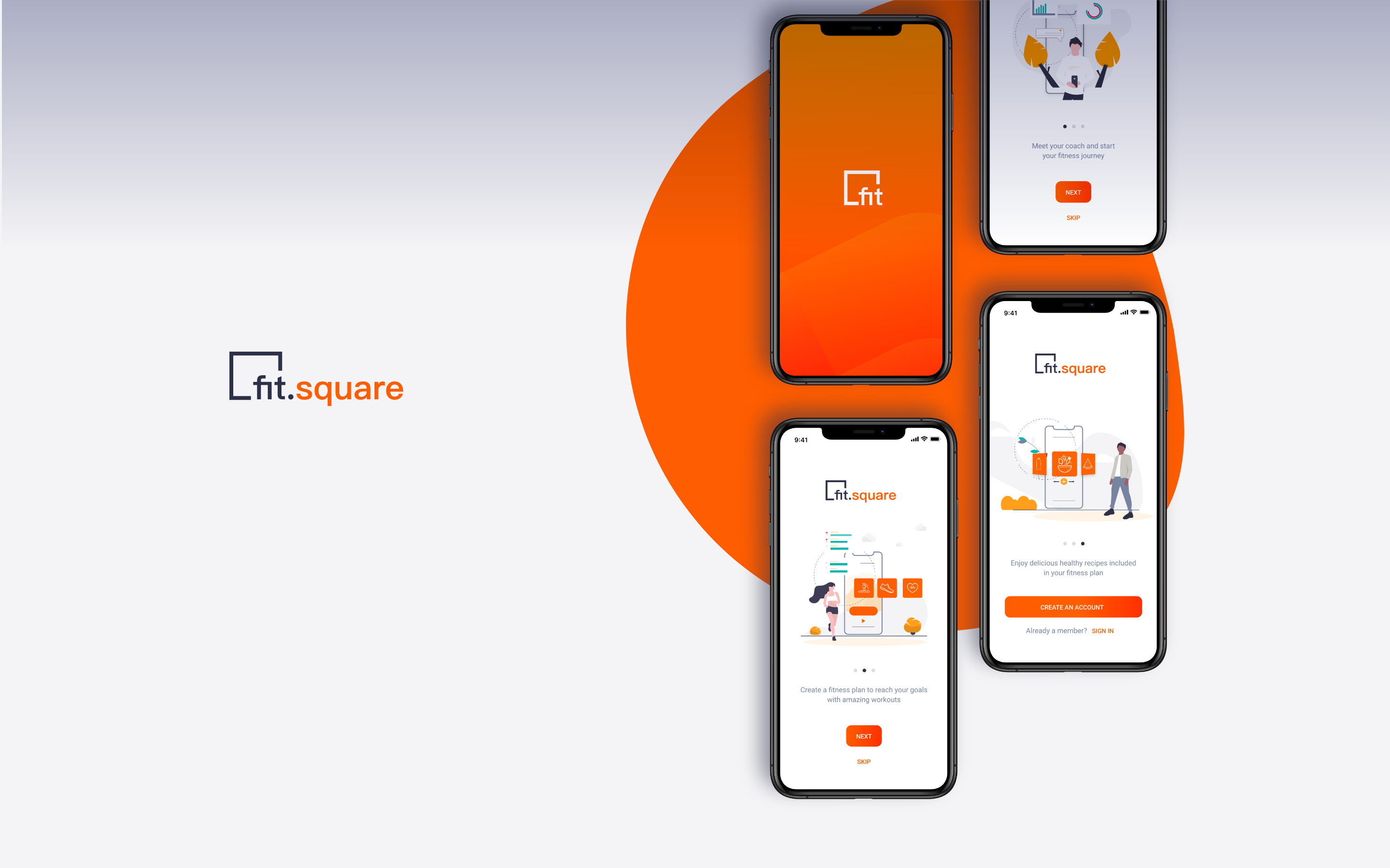
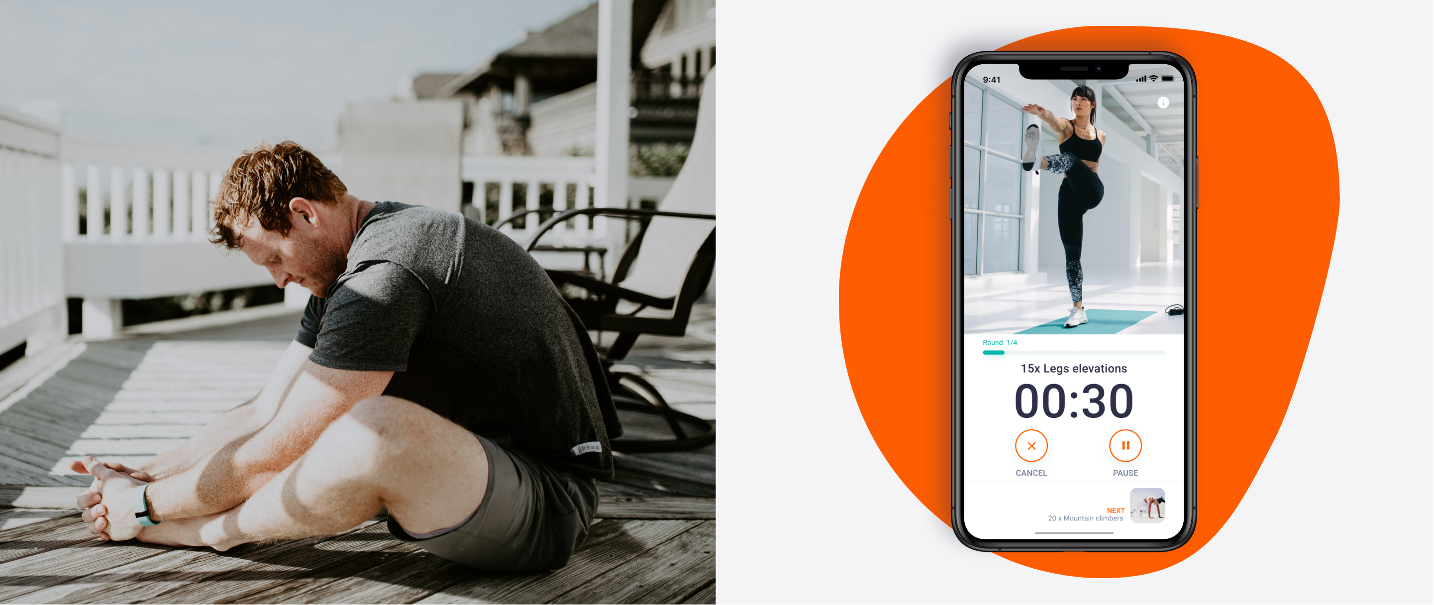
Fit.square is a responsive Health & Fitness Web Application that provides personalised fitness plans and coaching support to help users follow a healthy lifestyle and improve their wellness.
The Challenge. To design a digital product to change user behaviour in heath and lifestyle
This project has been realised as part of the Career Foundry UX Immersion Course.
The challenge was to apply the entire UX design process to create a web application. It should be noted that I did not have any UX experience before starting this project. My high-level goals were to:
- Design a responsive Web application that enables users to create a Fitness plan and contact fitness experts in training and nutrition.
- Create a High-fidelity prototype that allows us to test and validate the design with potential users.
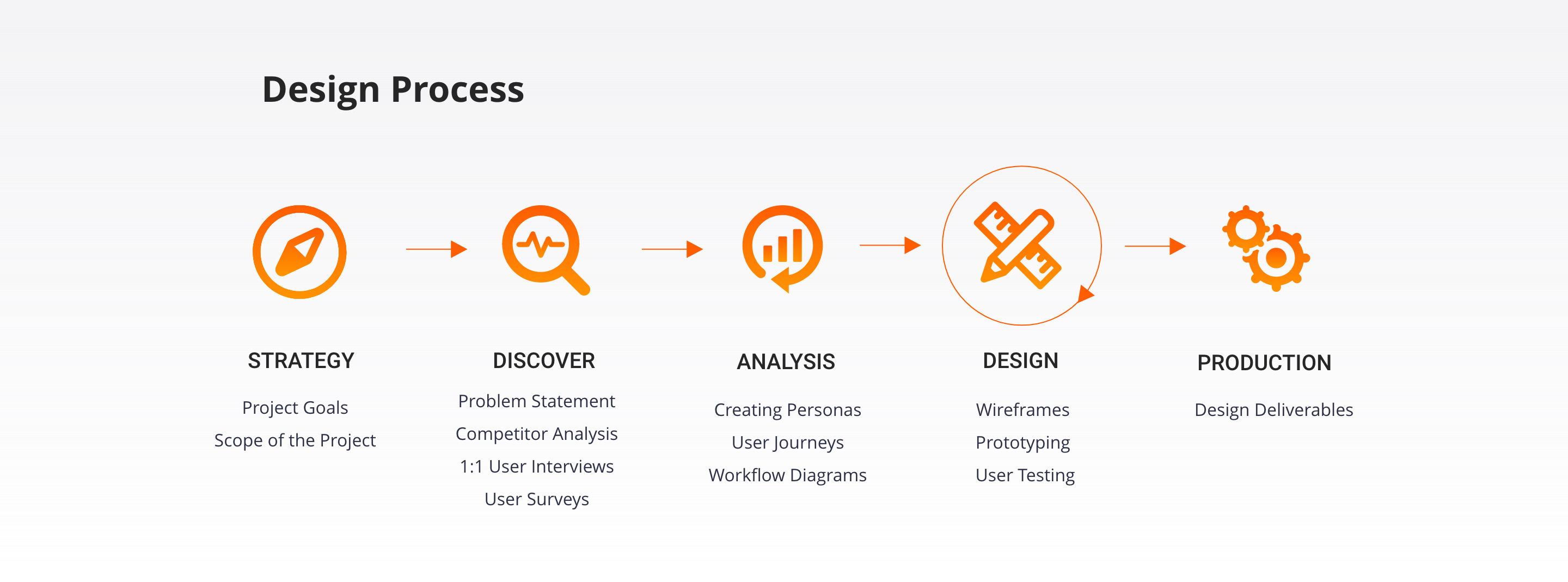
Design Process
Dicover
Competitive Analysis. Getting insights from our competitors in the field
The next step will be to identify potential competitors in order to identify opportunities and risks in the market. I conducted an analysis of two of my competitors, Asana Rebel and 8fit. Both products offer users training and meal plans.
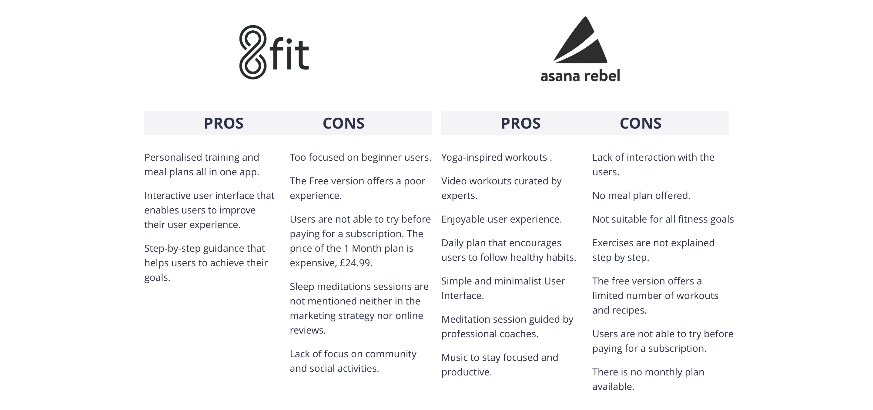
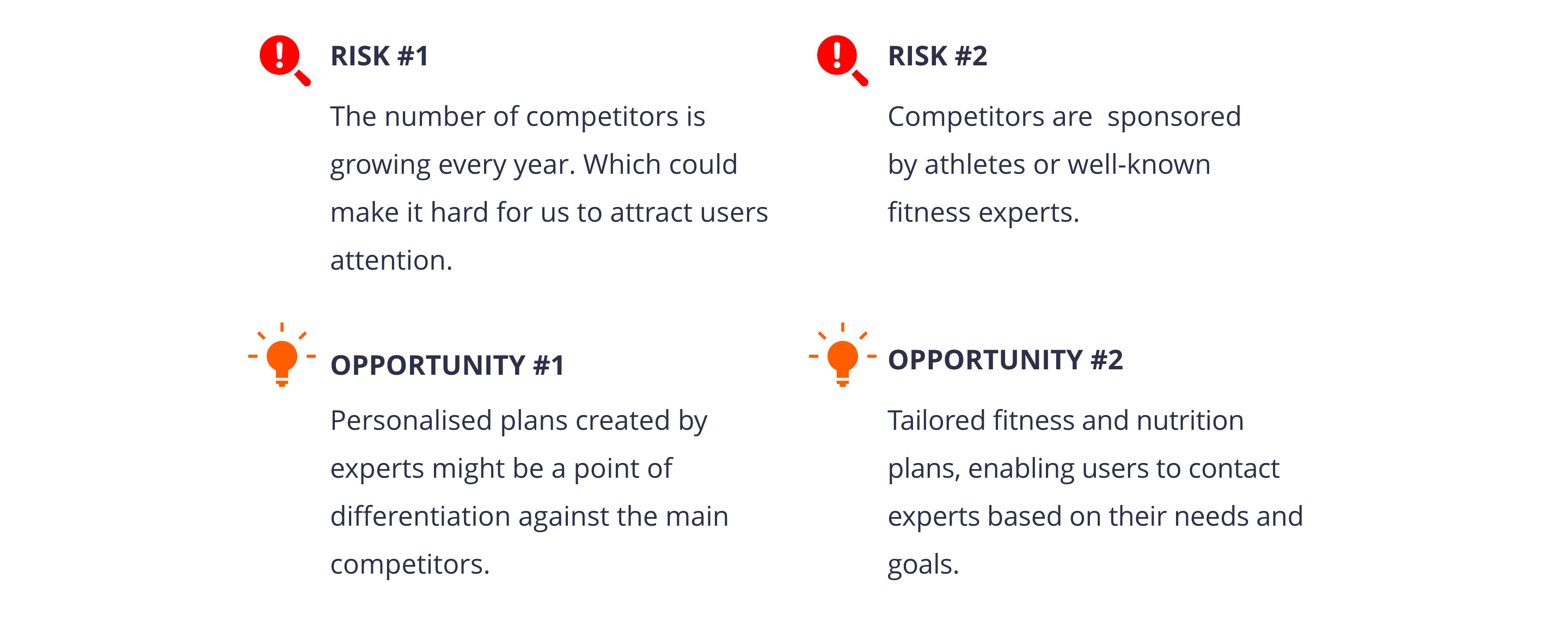
In conclusion, it is possible to launch a competitive web application that offers personalised fitness and nutrition plans created by experts. The key will be to design a personalised user experience aimed to connect with experts in fitness and nutrition.
User Research. Getting user insights
User interview is a core method of user research. That is why I chose to interview 6 people from our target audience.
The interviews took approximately 30 minutes. This was the most relevant information for decision-making in creating the solution.
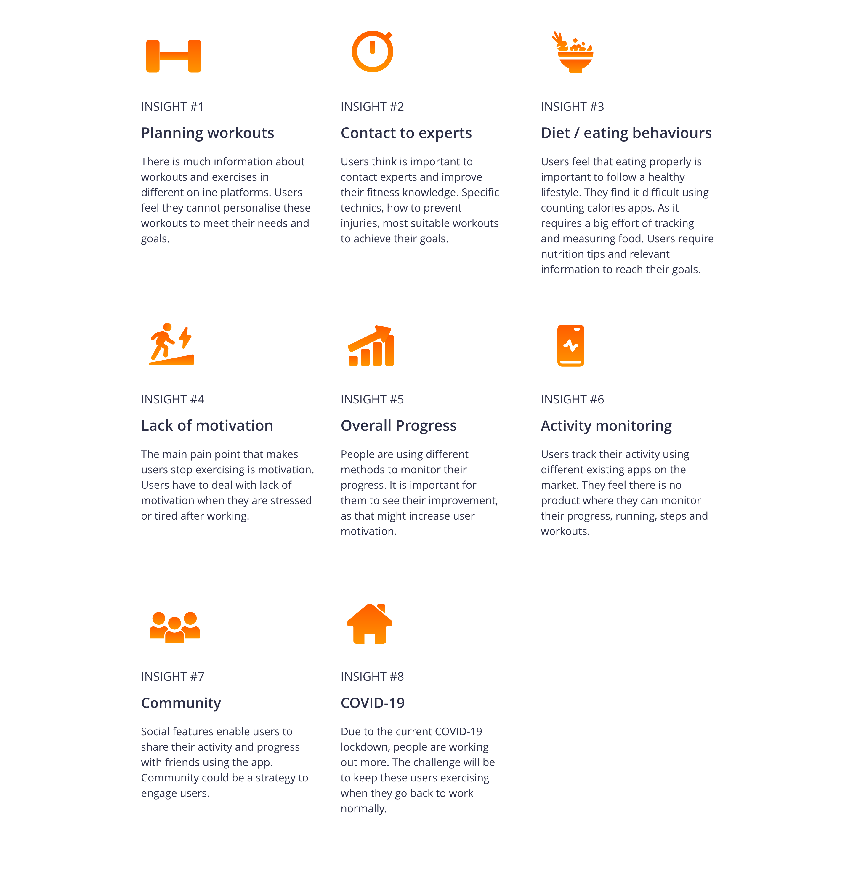
Analysis
Personas. Building Empathy to define the users
Using the insights from interviews and survey results, I defined three personas to better empathise with my target groups and prioritise goals according to their needs.
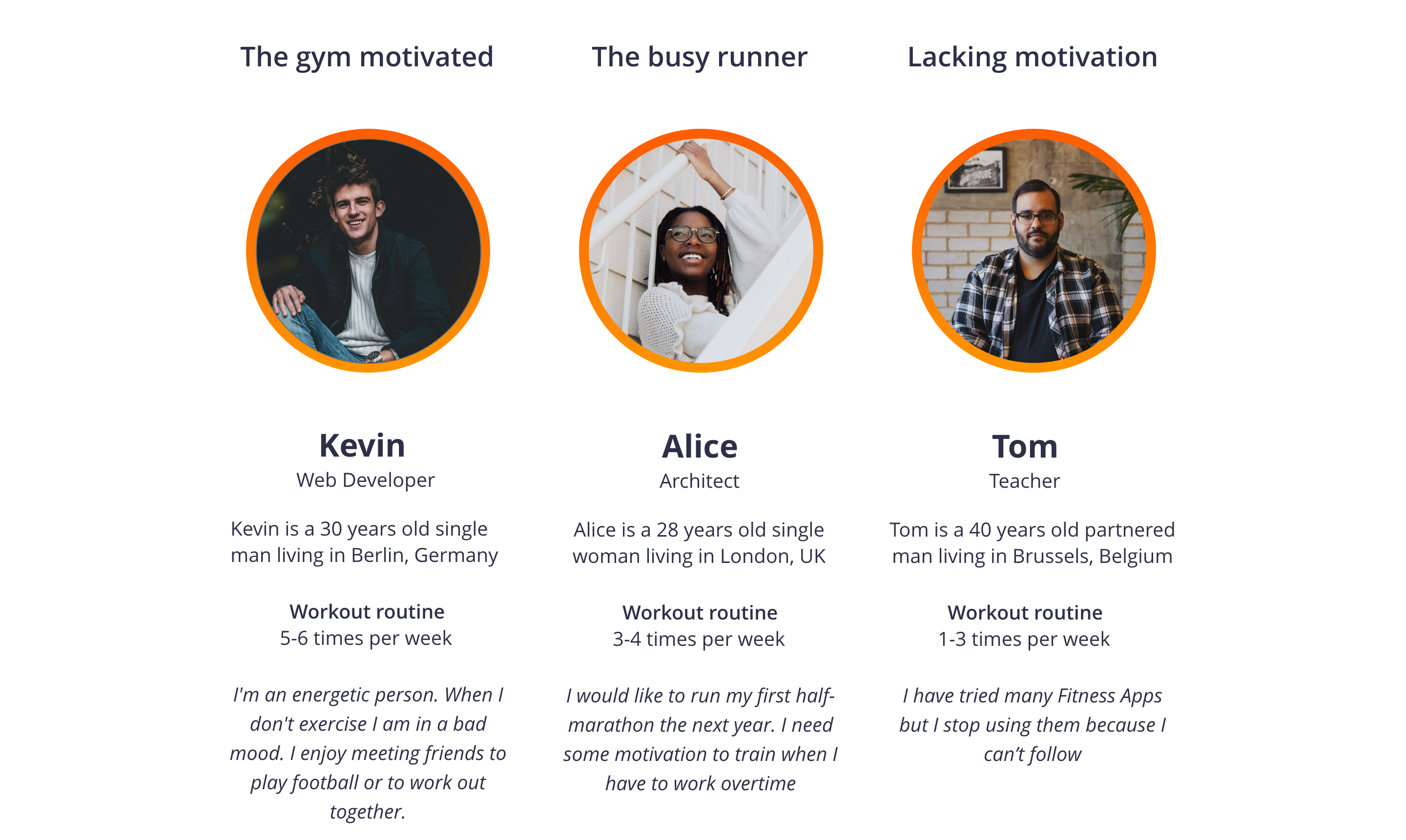
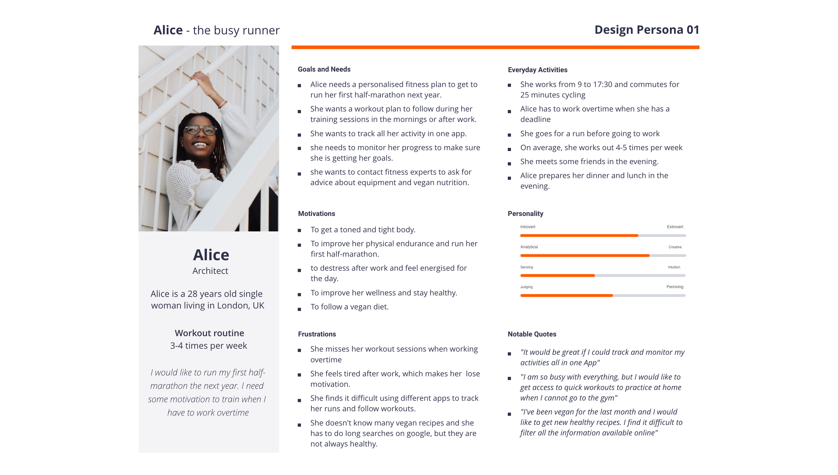
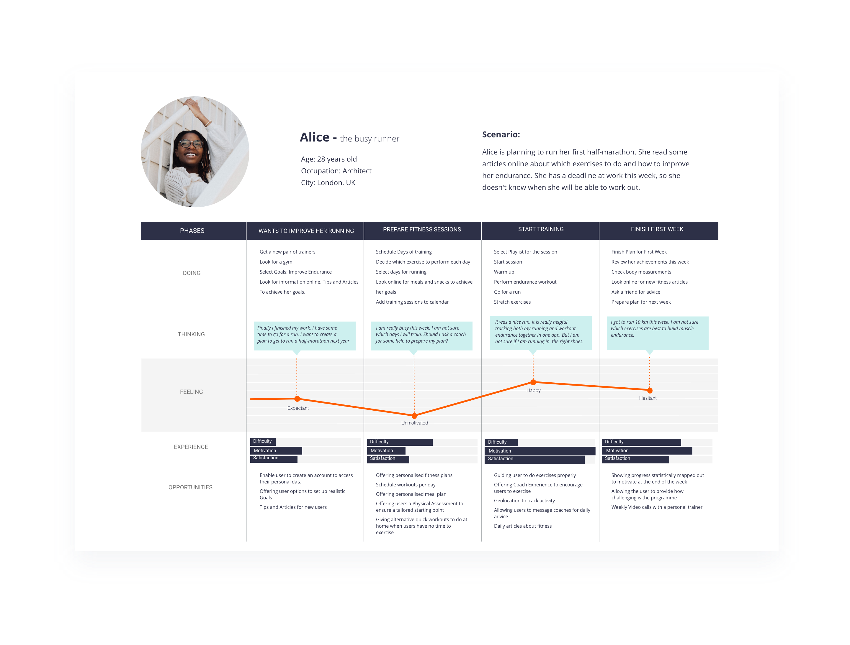
After defining the different personas I created a user journey for each one. Then, I realised that the selected workflows were related to the three personas. That is why I chose one of the personas, Alice, for the next steps of the design process.
The user journey shows the different steps of the scenario in which Alice is working to achieve her goals. The objective is to discover possible opportunities for interactions with the product.
User stories. Translating user needs into features
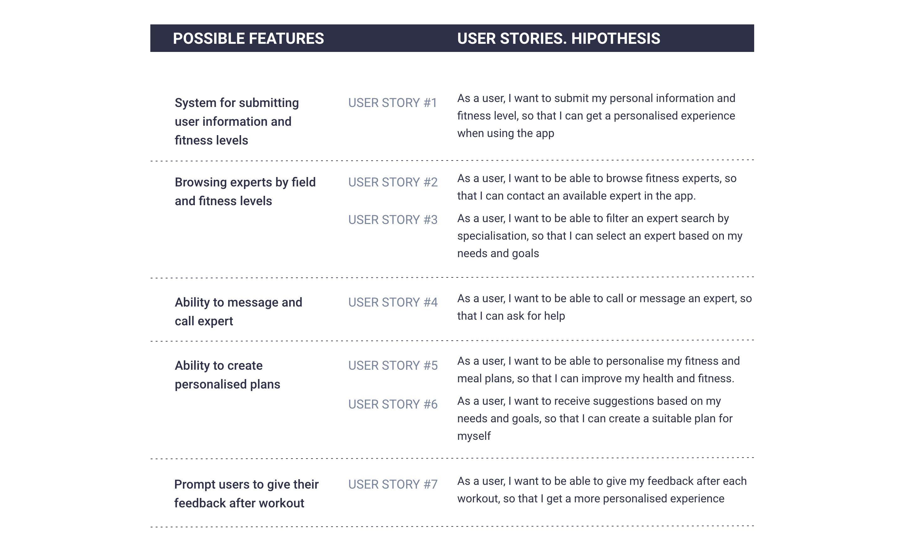
After analysing the insights from creating personas and user journeys, I was able to create a list of possible features for my product. The next step was to translate those features into user stories. This methodology allowed me to distill the user needs and the business requirements down to small, readable, and executable parts.
User flows. Defining user interactions to complete tasks
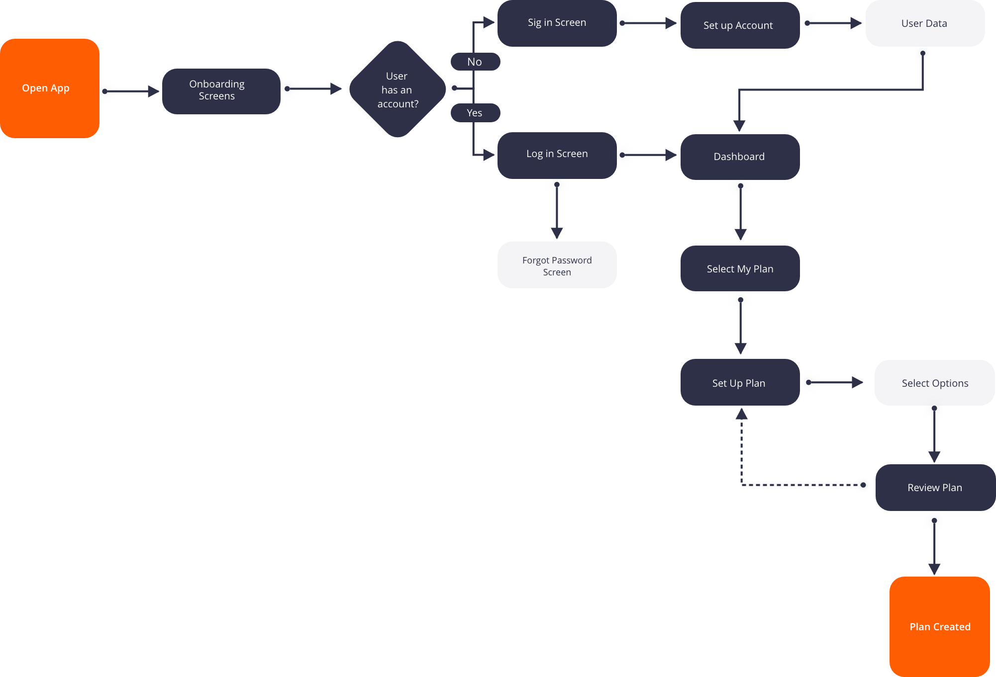
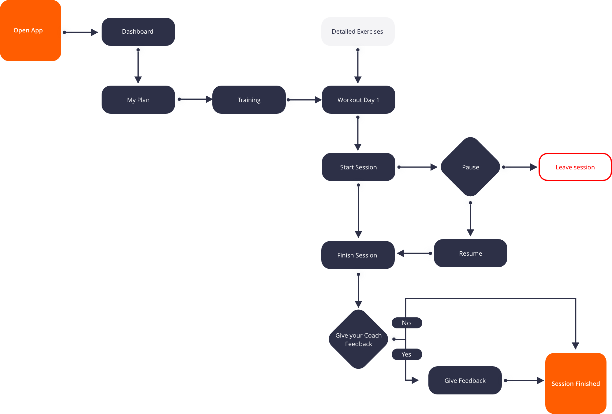
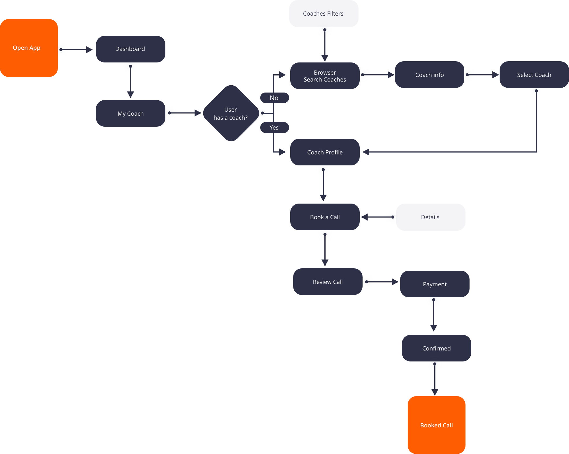
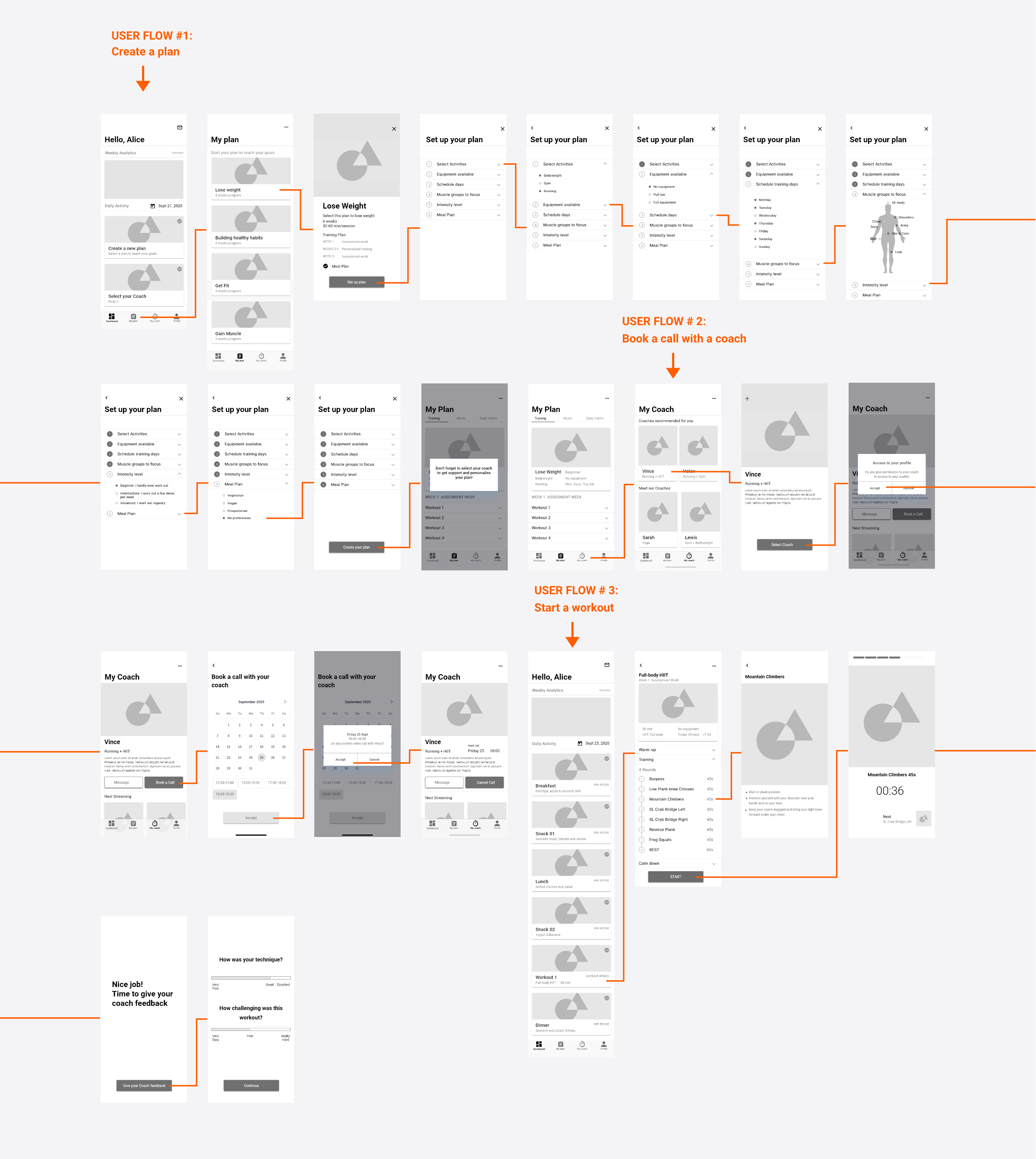
From the user stories I have a bunch of goals that users want to achieve when approaching the product. The following feature flowcharts describe the user flow through the Web application, listing potential features users may interact with. Rather than a list of screens or pages, user flows have a beginning and an end.
Design
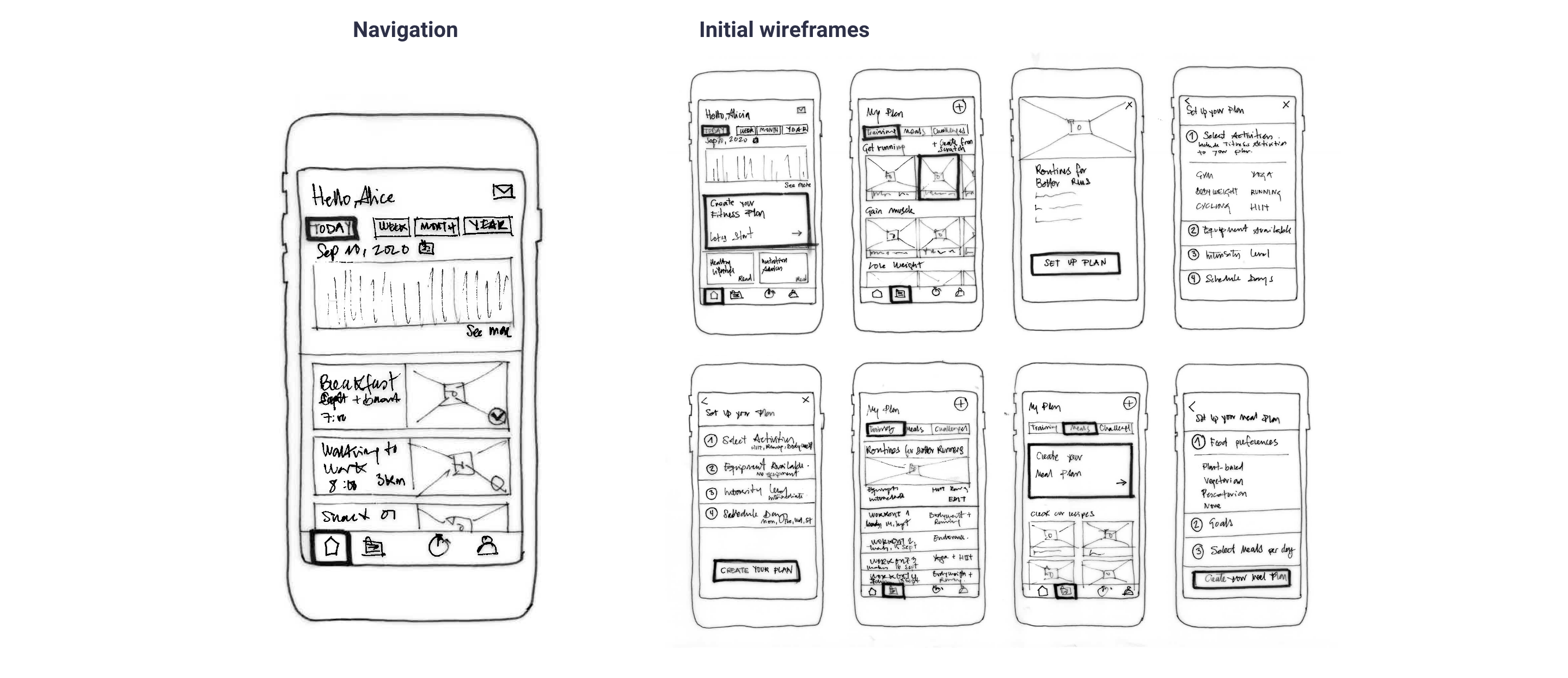
Paper Prototyping. Gathering potencial solutions
By now I have already gathered enough information to get started with the wireframes. I created this set of low-fidelity wireframes of all of the key screens needed to complete the main user tasks that I will be testing for: creating a fitness plan, booking a call with a coach, and starting a workout session.
Mid-Fidelity Prototyping. Defining the design
After some paper prototyping adjustments, mid-and high-fidelity prototypes were created to test the idea with users and fix the problems in the early stage.
Usability Testing. Validate the dsign with potential users
User tests revealed small vulnerabilities in the structure of the user interface, in some formulations and interactions. In addition, the users asked smart questions, which led to further improvements.
Production
User Interface Design. Defining How it feels and looks
Using the insights I gained from the preference test conducted with the midfidelity prototype, I was able to focus on the UI design for the project. I did an effort to revise and boost the visual elements of the mobile version of the product.
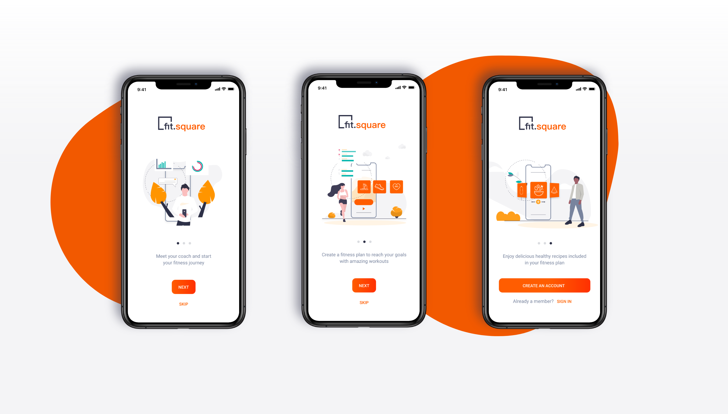
Log in and onboarding
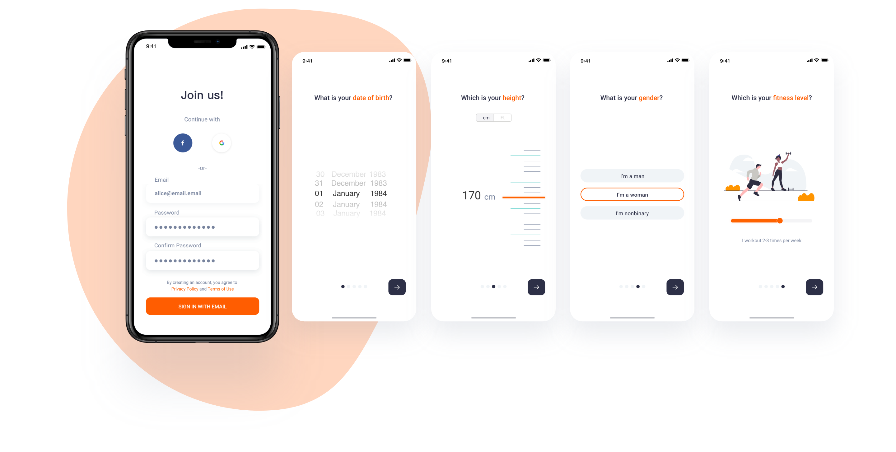
The app allows users to create an account to access their information. When users first approach the product, they are prompt to add data about their gender, weight, height, and fitness level.
Dashboard. Activity Tracker

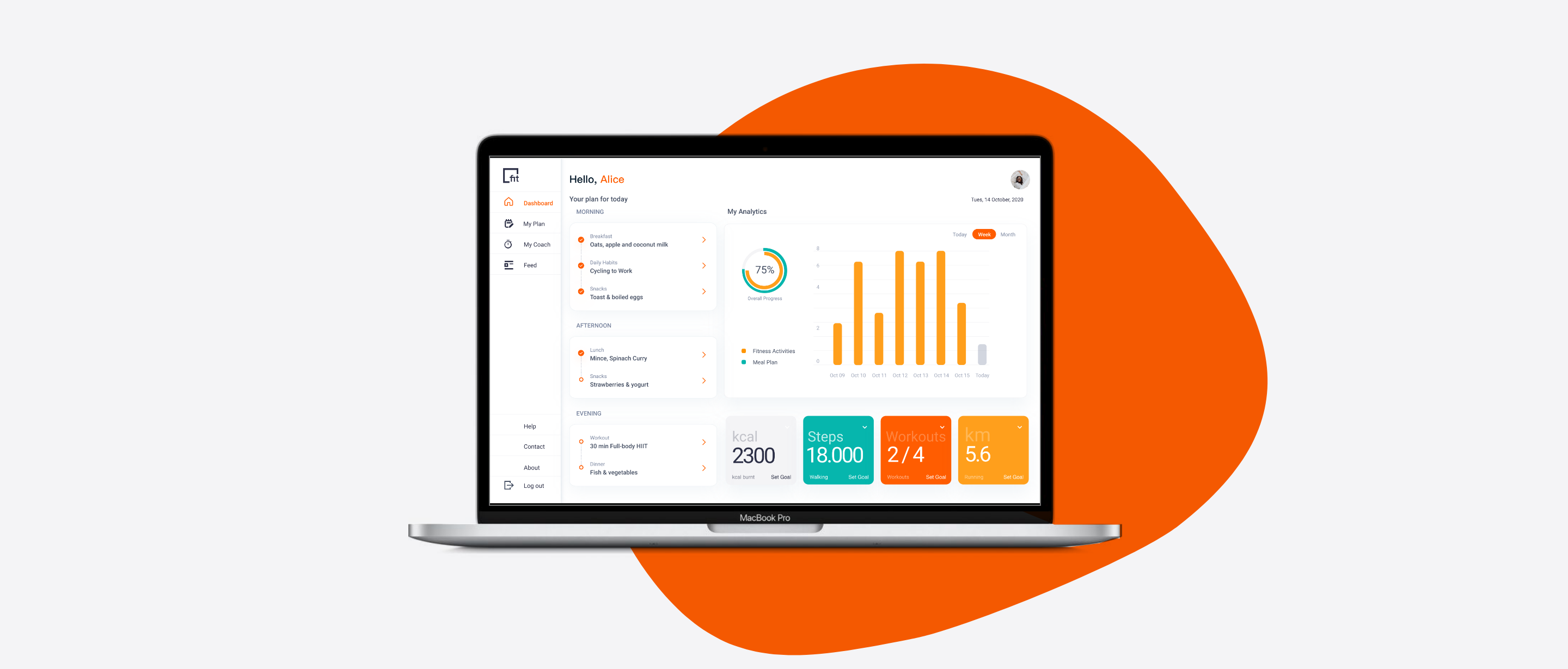
The Dashboard is the first screen that users can see when opening the app. They can see their Analytics and all the activities included in their fitness plan for that day. If they don’t have a plan yet, they can see a call to action to start.
My Plan
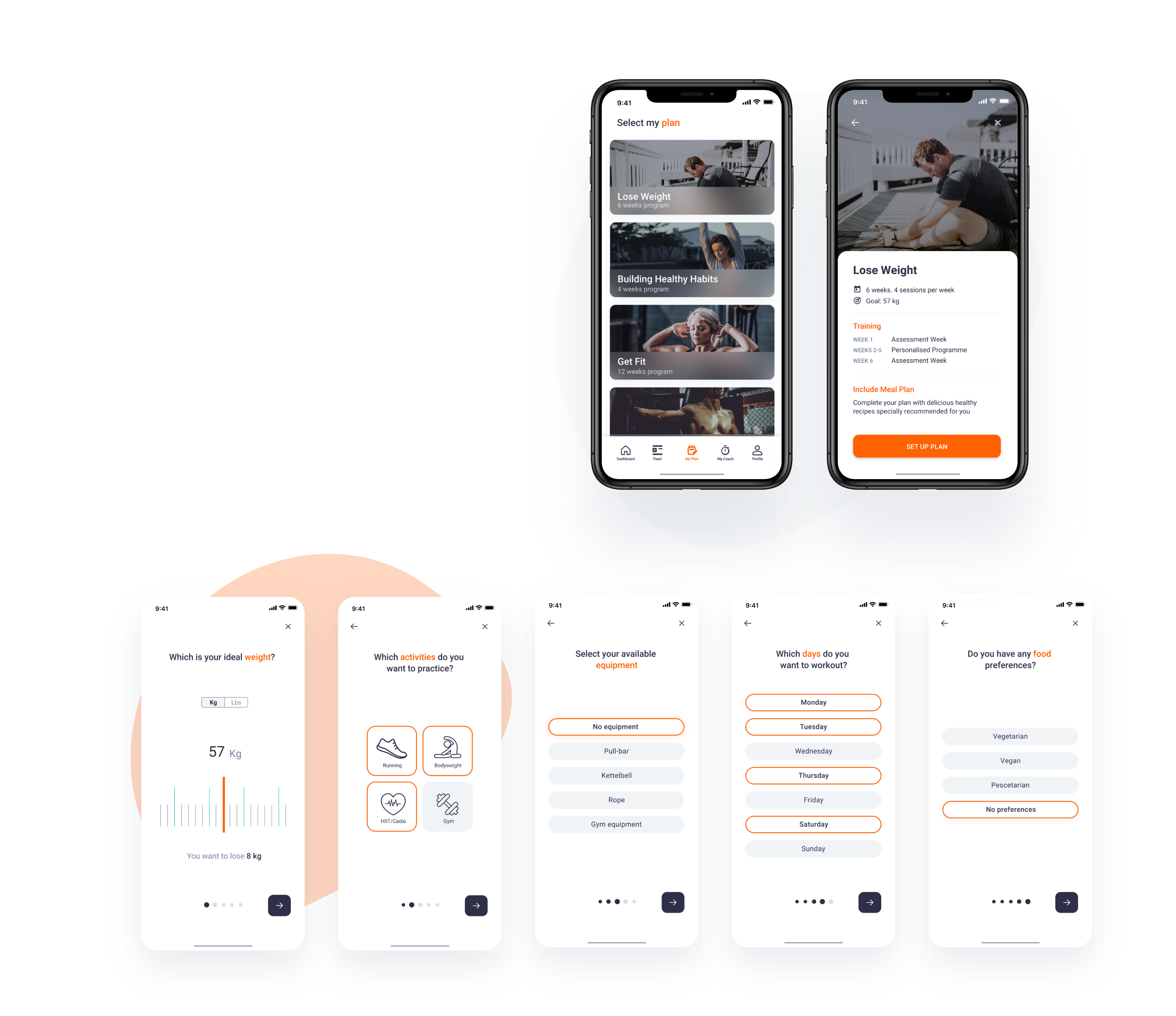
My Plan Screen enables users to create personalised fitness. If there is no plan created yet, users can select a new plan based on their goals: lose weight, building healthy habits, get fit, and gain muscle. A step-by-step process, guided users to set up the plan.
Workout
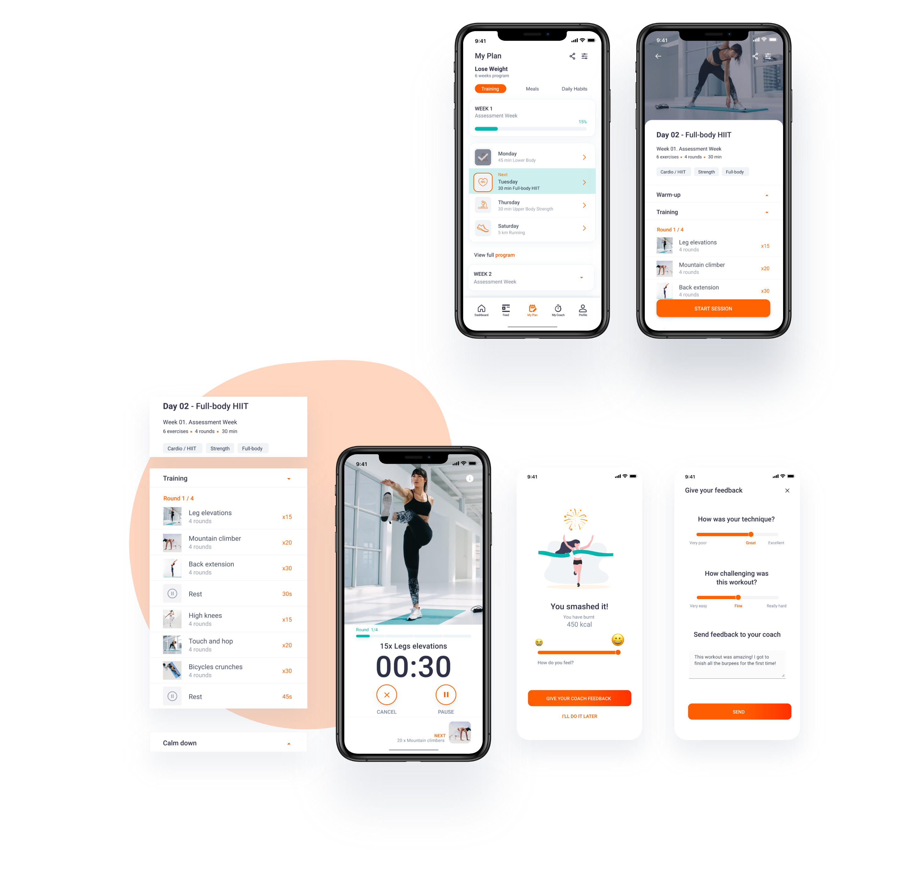
My Plan category shows a menu with three sub-categories. The training tab collects all the information about workouts and exercises included in the plan. Users can perform the workout assigned to each day of the week.
Feedback
At the end of the session, the app enables users to give their coach feedback.
Recipes
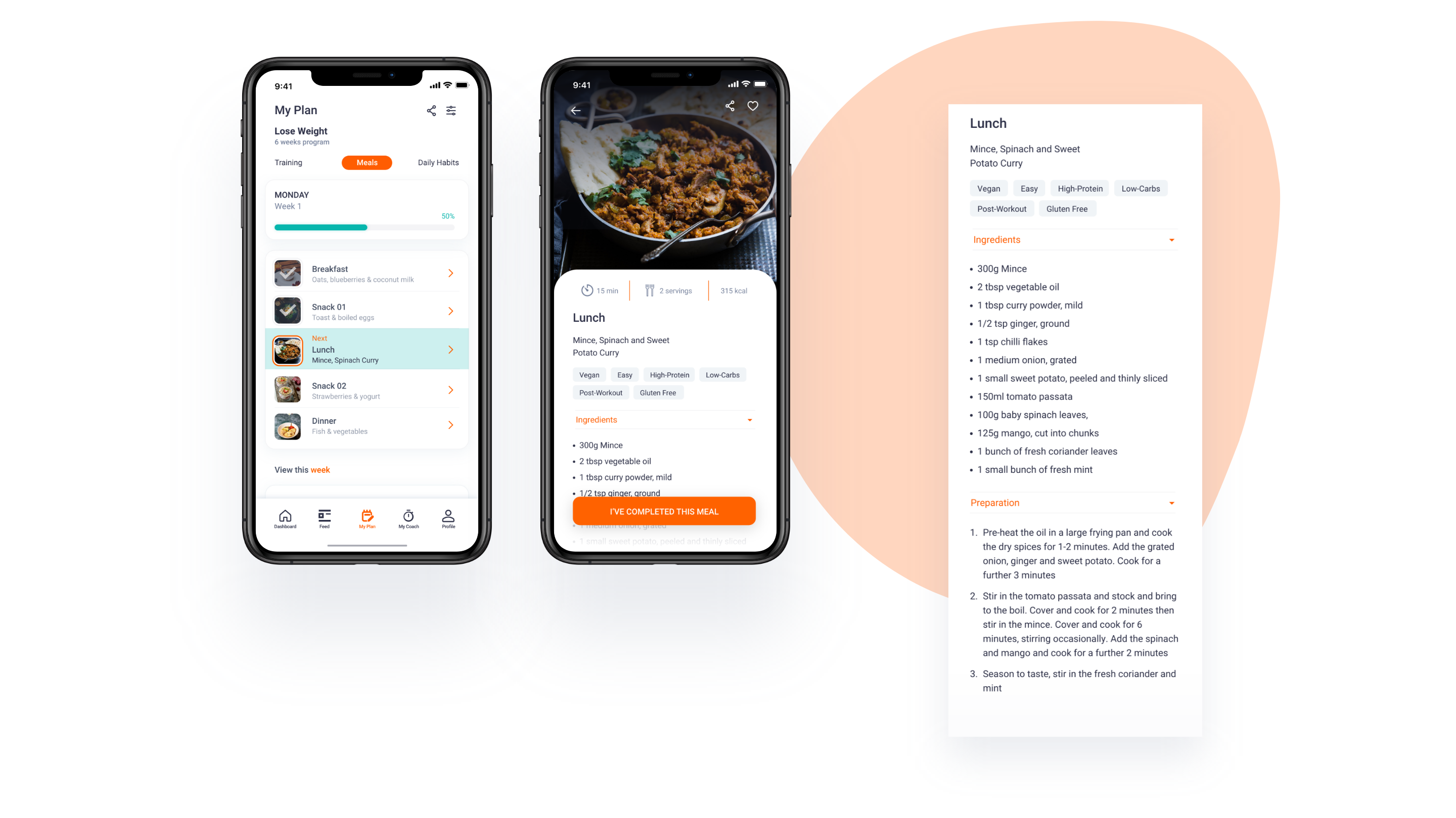
On the Meals tab, users will access a healthy meal plan, especially personalised based on their goals. It includes a healthy meal plan with recipes for healthy meals throughout the week. Users will be able to select which recipes they have completed. They will be included in their activity tracker.
My Coach
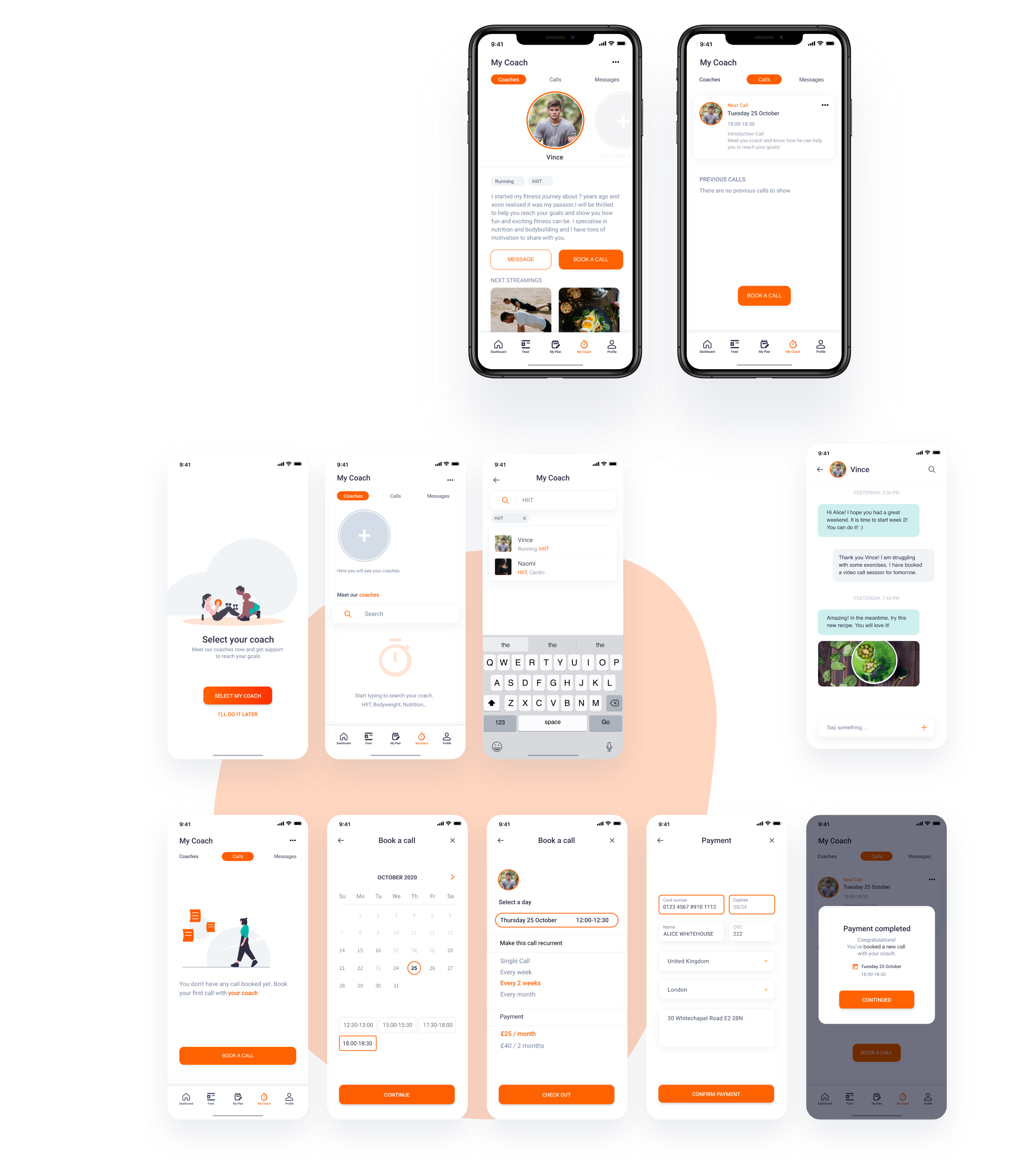
My coach category enables users to select personal coaches and contact them to follow their plan. The last design iteration includes the viability to select more than one coach. The search bar tool allows users to browse a coach, based on the activity in which they need some advice, HIIT, Cardio, Nutrition…
Design System. How to build a Health & Fitness Web Application
The Fit.square design reflects the energy and excitement of fitness, using a bold aesthetic that expresses engagement and achievement. Its UI contains shapes that invite the user to personalise them with their progress. Its copywriting speaks with a friendly, can-do tone of voice.
Typography & Colours
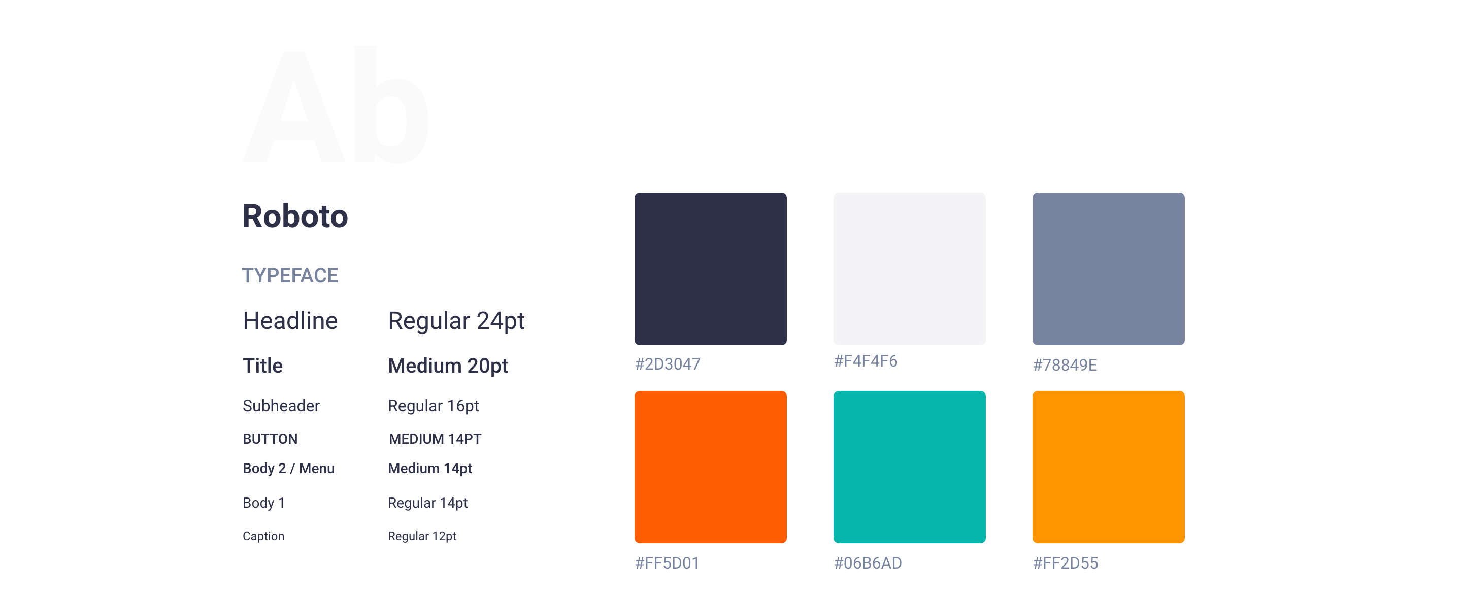
Roboto is the cornerstone element of the product’s visual language. It has a mechanical skeleton and the forms are largely geometric. At the same time featuring friendly and open curves.
Strategically selecting the colours for our product will allow us to create the feeling of energy and vitality we hope to invoke. Also, it brings a unified and recognisable consistency to the product.
Icons and buttons


Illustrations

Illustrations can communicate personality, delighting user goals, or make UI more informative. I adapted the illustrations from unDraw. The illustrations’ colours were adapted to the brand’s universe, using variations of orange, green, and yellow as main colours.
Photography
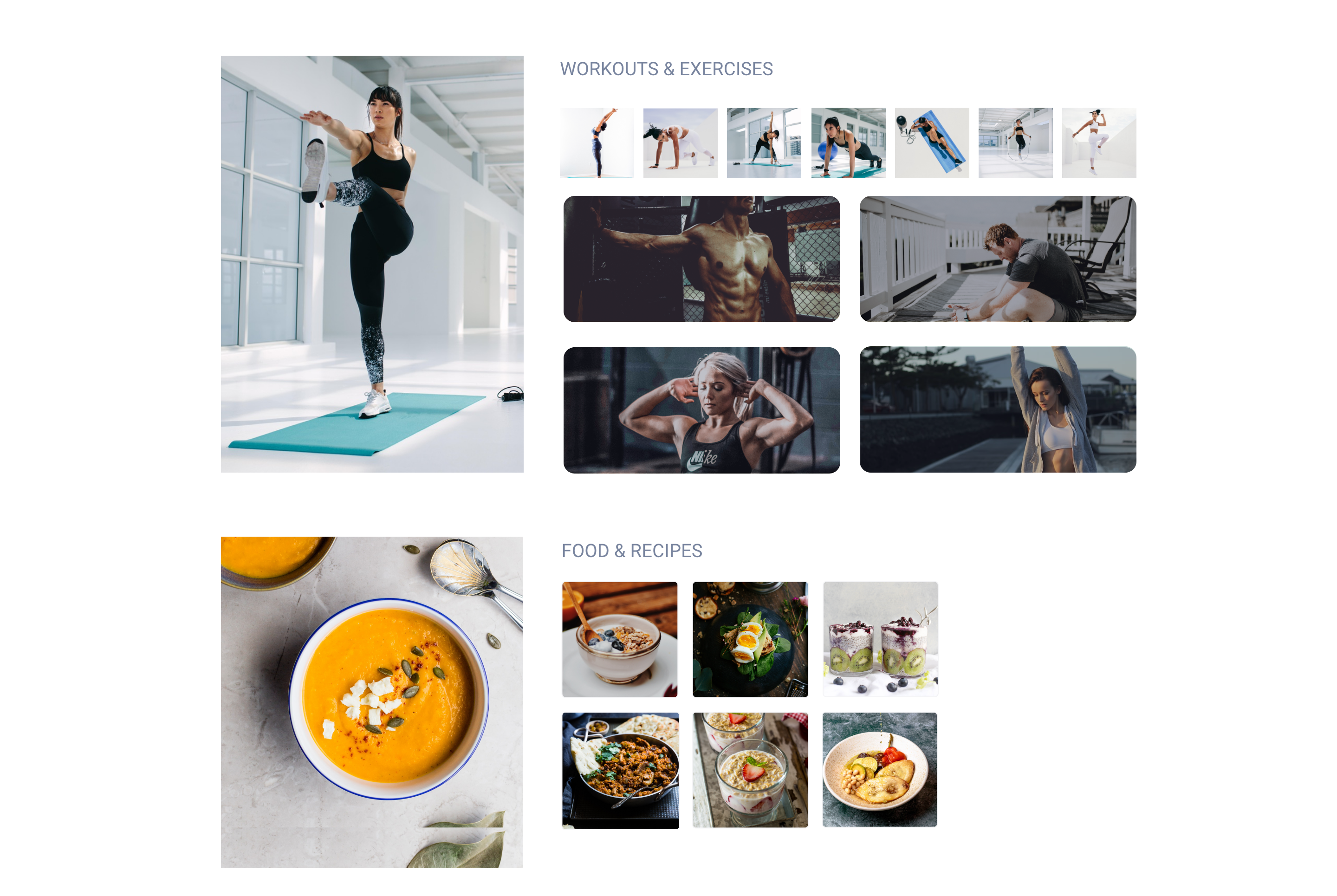
For Workout photographs, I have used the photos by Jacob Lund from Noun Project. The rest of the photos are courtesy of unplash.com
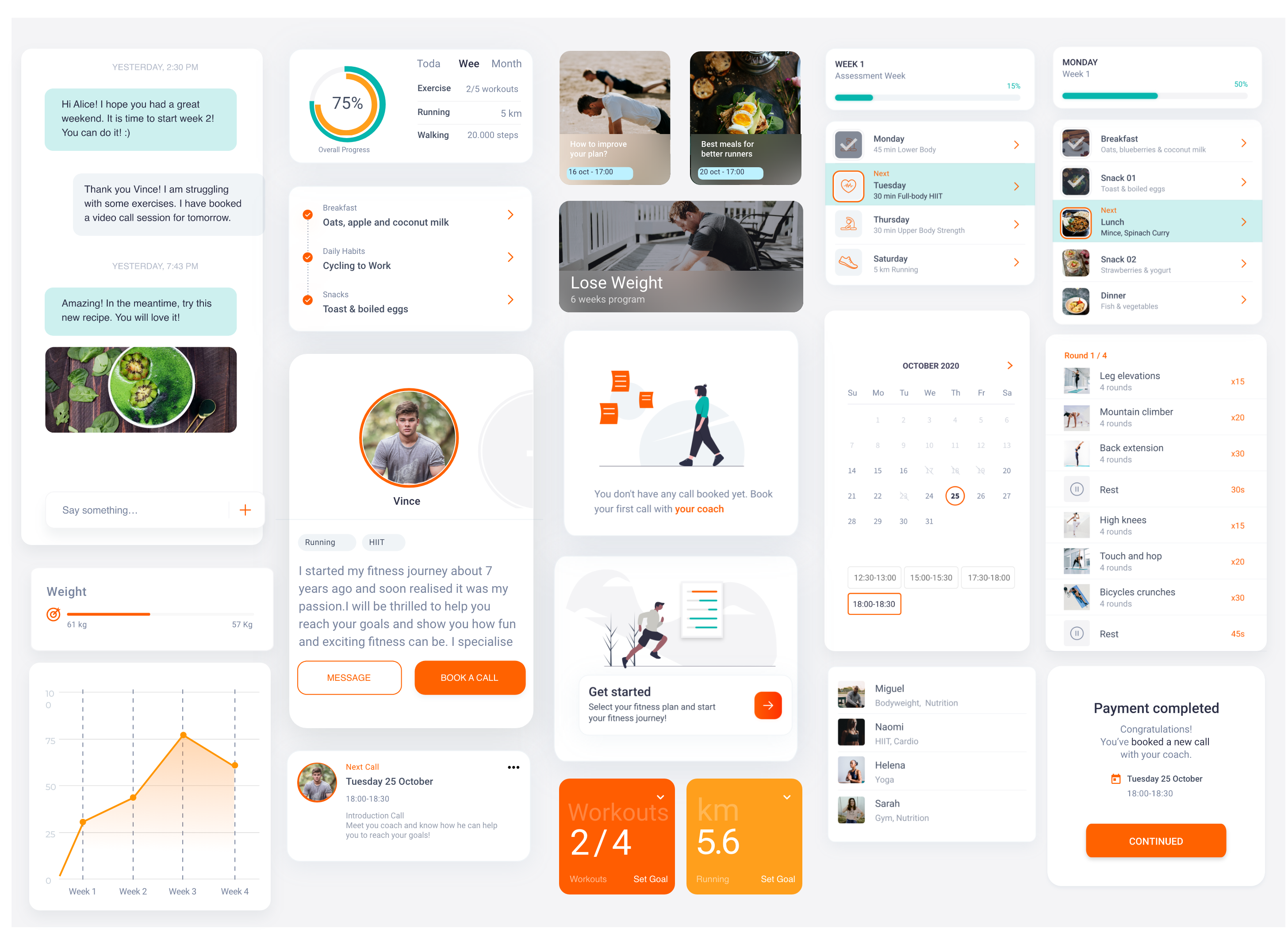
Other UI Elements
Conclusion
Lessons learned
The challenge of the project was to design a product that could have an impact on user behaviour in health & lifestyle. From the discovery stage, I understood that lack of motivation was one of the main points that stop users from exercising. The product should attract new users and engage them to follow a fitness plan over time.
The most challenging part of the project was to create an intuitive, simple, and clear user interface that is able to host all the features of the product. I would point out the following lessons learned.