Upcards. Learning Vocabulary Application
Overview
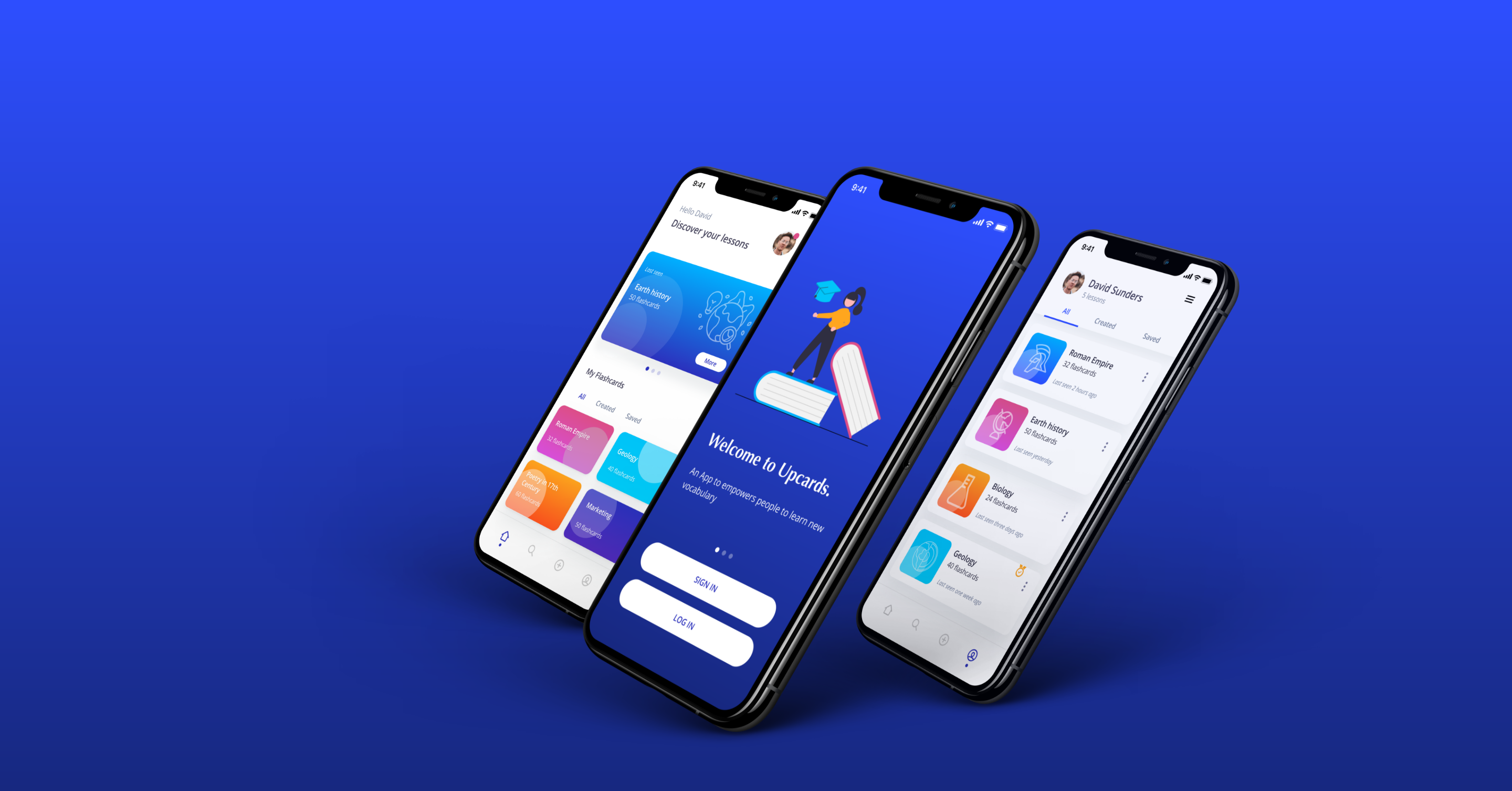
Upcard is a mobile application that empowers users to learn new vocabulary. I believe that learning something new is a critical life skill no matter age, location, or circumstances.
With that said, it can be incredibly difficult to design a product or service that meets everyone’s needs at the same time. The first step should be to define the specific circumstances and specifications of the problem to solve.
The Challenge. How might we design a mobile app that empowers people to learn new vocabulary?
The challenge of this project was to practice my design process for one month and apply it to create a mobile application that focuses on learning new vocabulary.
My high-level goals were to:
- Design a mobile application with a visual-orientated interface that allows users to make and review flashcards using different methods of study.
- Create a low-fidelity prototype that allows me to test and validate the design with potential users.
Dicover
Competitive Analysis. Getting insights from the market
The discovery stage started by identifying potential competitors in order to gather opportunities and risks in the market. I conducted an analysis of three of my competitors, Quizzlet, TinyCards & Brainscape.
- Quizlet offers a wide range of content and different ways for users to learn.
- Brainscape uses spaced repetition process and a ranking colour guide that helps users to track and improve their knowledge.
- Tinycards has a nice, simple a colourful interface that allows a desirable and enjoyable user experience.
The challenge will be to stand against our competitors by offering a mobile application that provides valuable content tailored for users. The interface should ensure an enjoyable learning experience by offering different methods of reviewing and studying new vocabulary.
User Research. Getting user insights
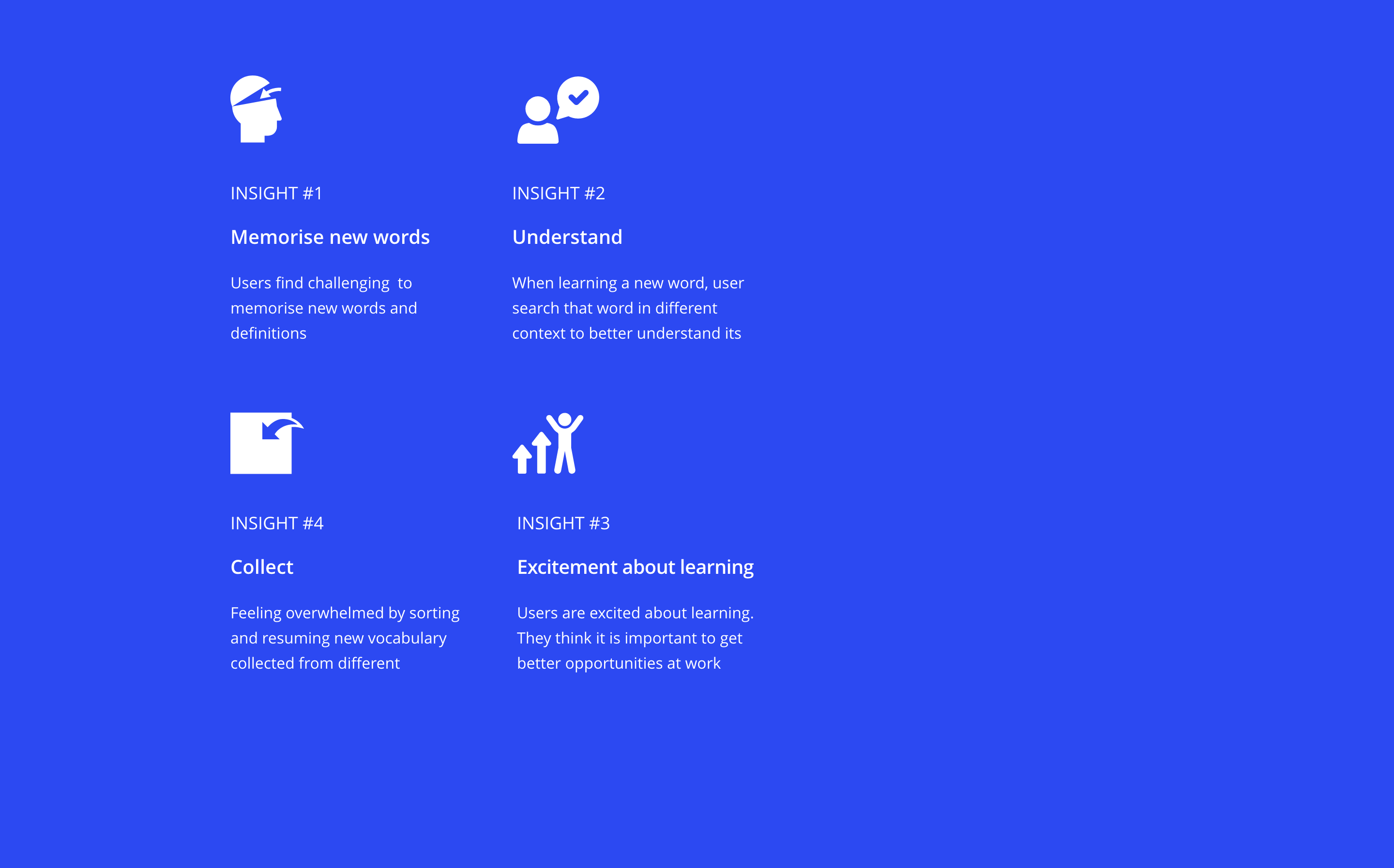
User interview is a core method of user research. That is why I chose to interview 3 people from our target audience. The interviews took approximately 30.
The interviews took approximately 30. This was the most relevant information for decision-making in creating the solution:
Analysis
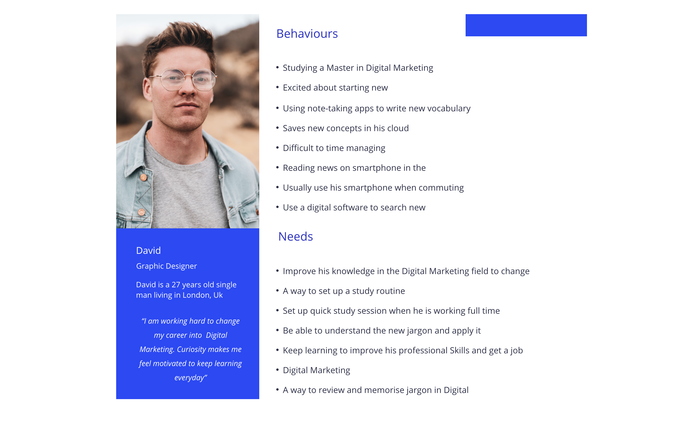
Personas. Building Empathy to define the users
Using the insights from interviews and survey results, I defined personas to better empathise with my target groups and prioritise goals according to their needs.
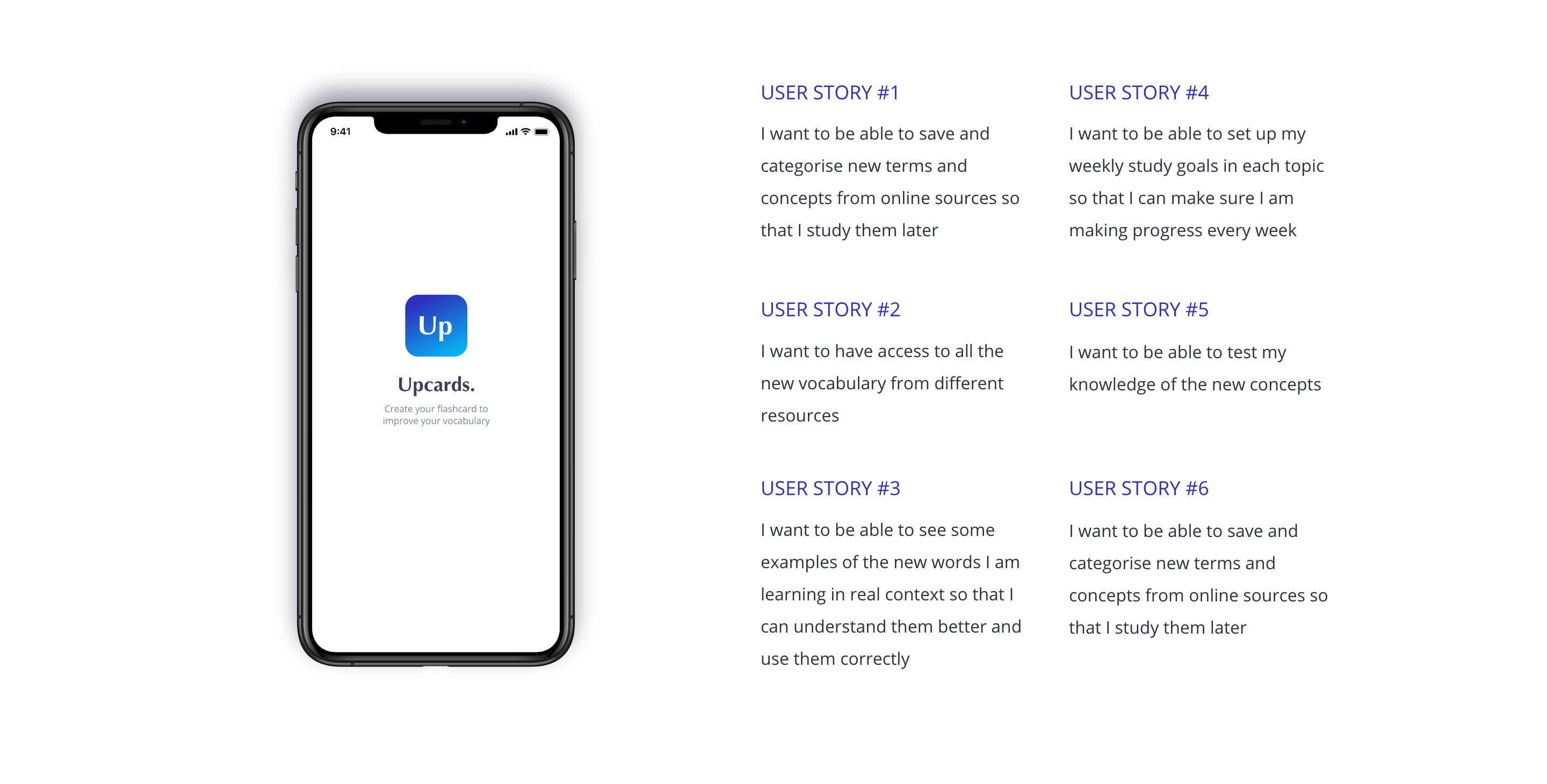
User stories. Translating user needs into features
After analysing the insights from creating personas, I was able to create a list of possible features for my product. The next step was to translate those features into users stories, as a hypothesis at this stage. This methodology allows me to distill the user needs and the business requirements down to small, readable, and executable parts.
Design

The Concept. Gathering potencial solutions
By now I have already gathered enough information to get started with the design stage. I wanted to create a low-fidelity prototype to validate my hypothesis with potential users.
Based on the insights from previous stages I put the effort into creating an interactive visual-orientated interface for making and reviewing flashcards using different methods of study.
Production

User Interface Design. Defining How it feels and looks
Using the insights from the usability test, I was ready to focus on the user interface design. The design principle evokes calm and responsibility, using minimalist elements that focus on the content to not disturb users from the study sessions.
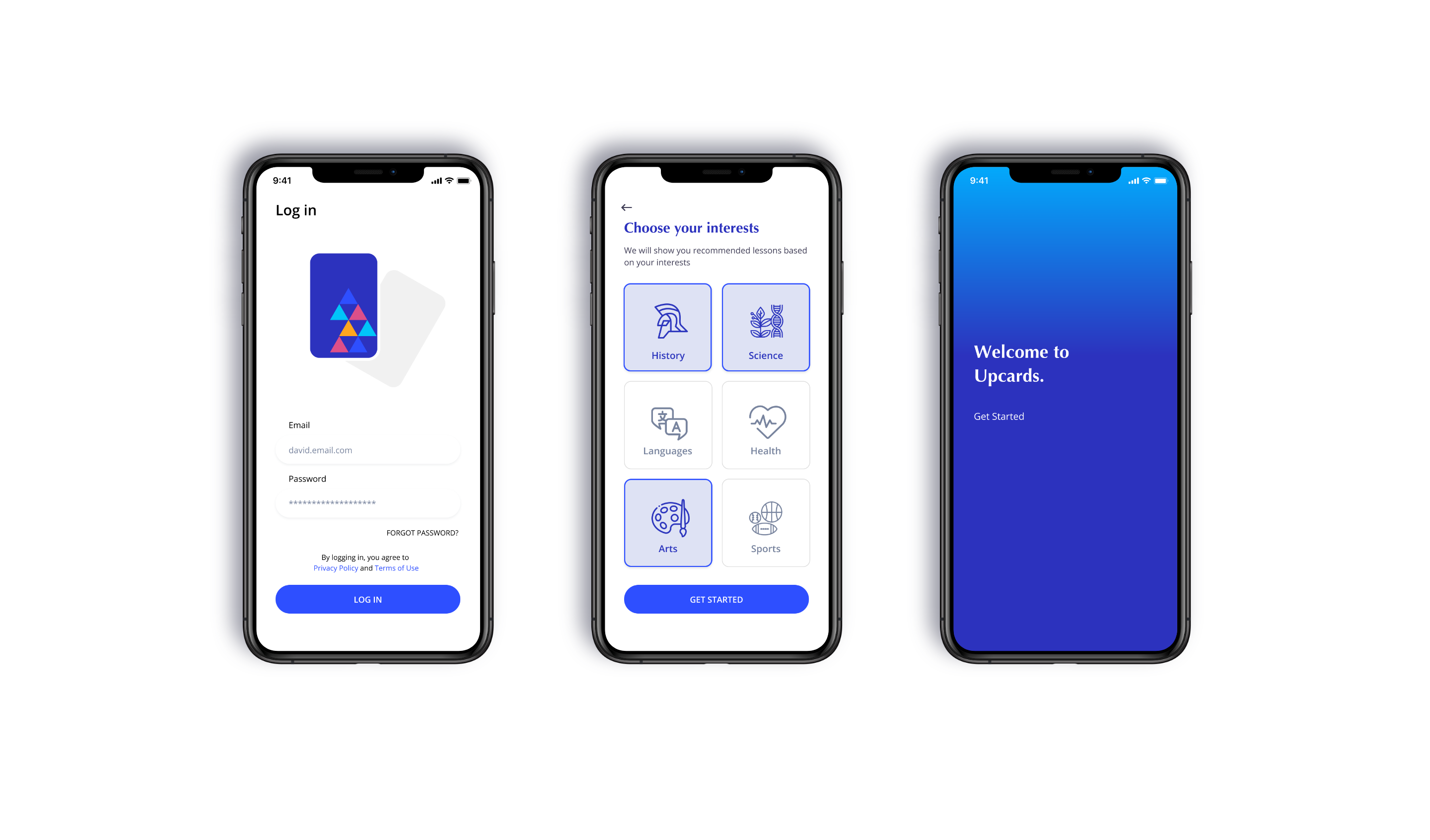
Onboarding process
The onboarding process shows uses the basics of the product. After creating an account, users are prompt to select their interests, so they will receive recommended lessons.
Access to your lessons
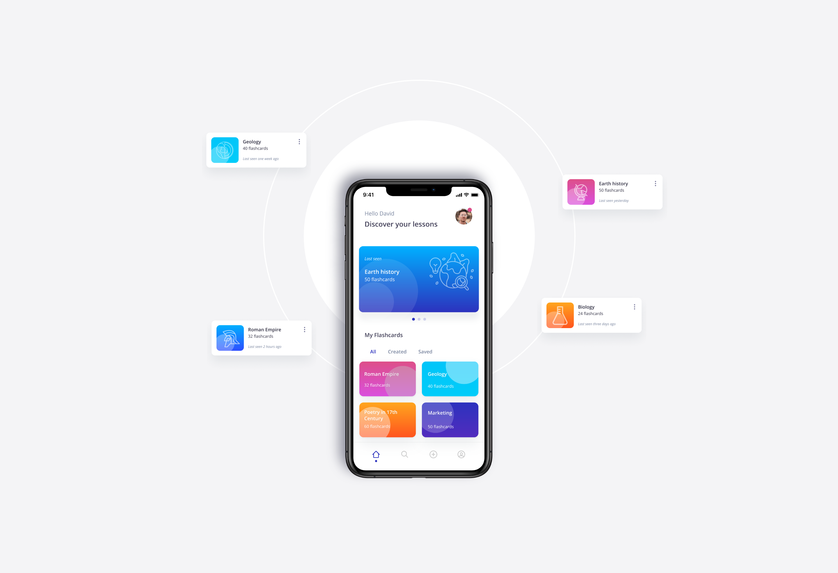
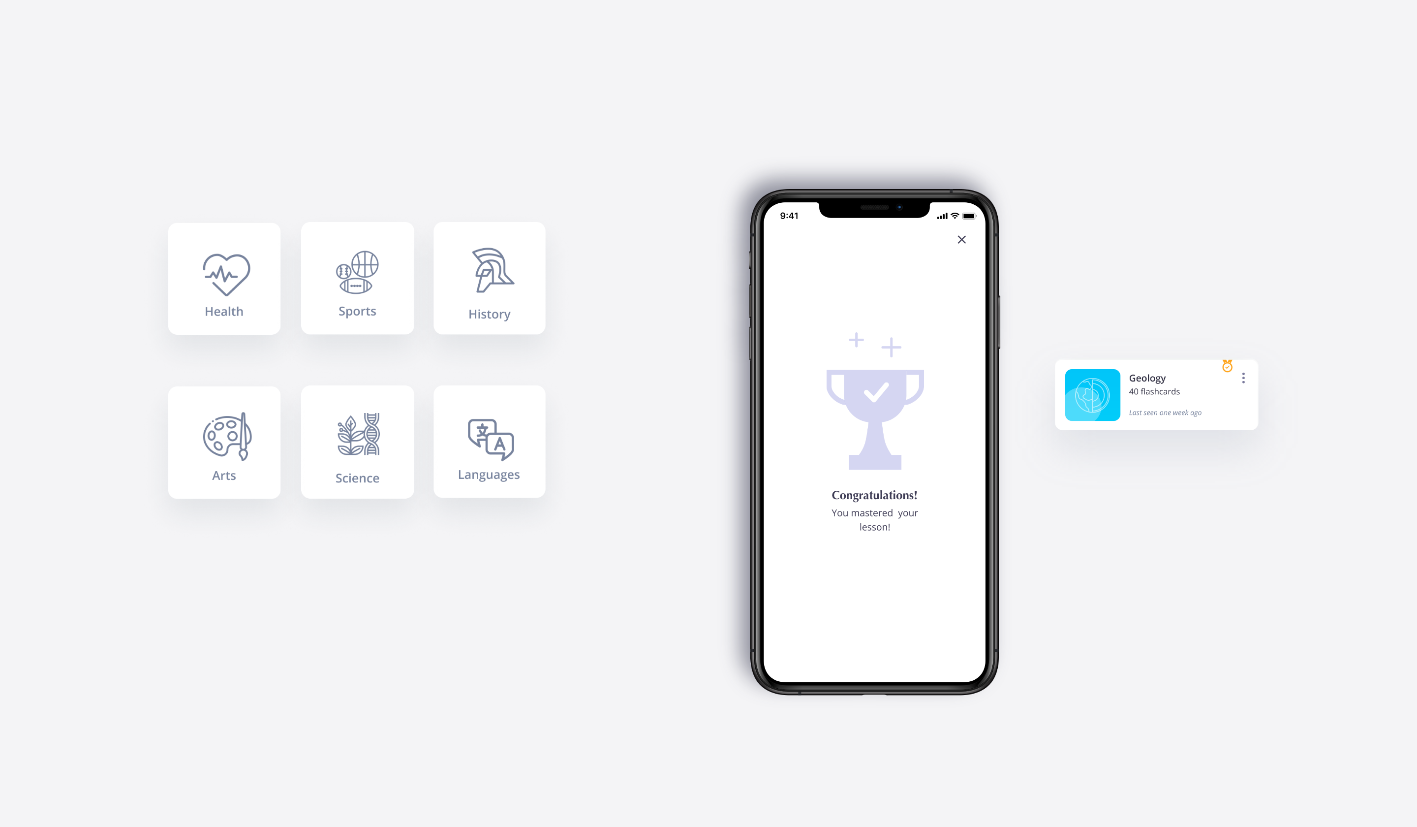
The Dashboard is the first screen that users can see when opening the app. They can see the last seen lessons and browse new lessons from different topics.
Add your own flashcards
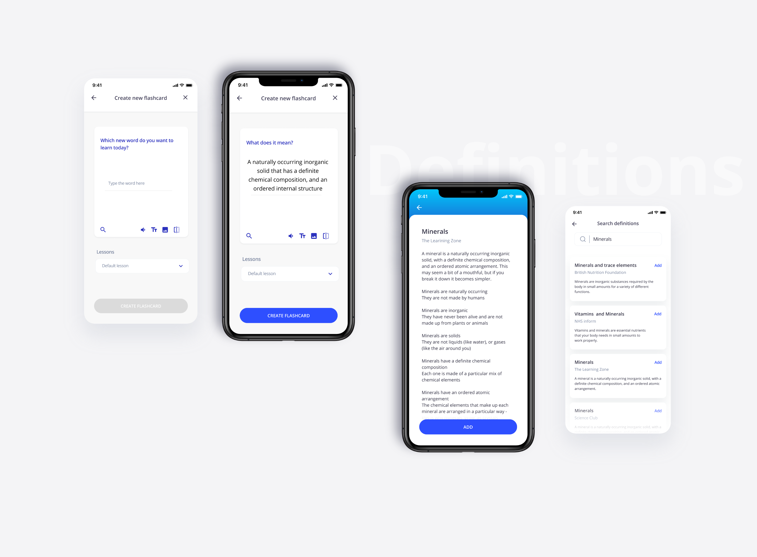
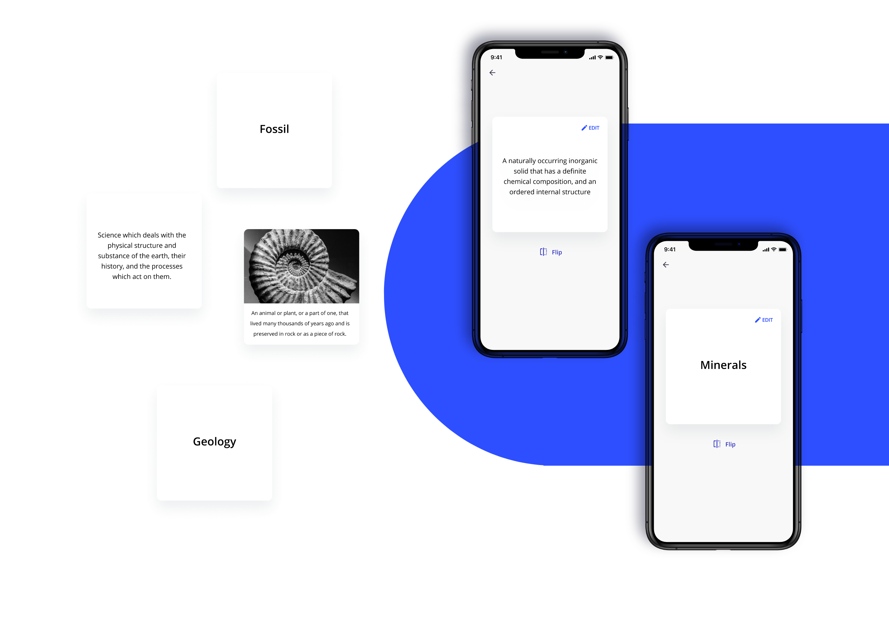
The interface enables users to add new words as flashcards from the tap bar. These flashcards can be organised into different lessons created by the users. The flashcard can be completed with images or notes to improve the visual aspect of the flashcards. The definitions can be introduced by users or selected by a list of resources.
Flashcards
Review flashcards
Users can access and review their lessons and flashcards from their profile.

Study sessions
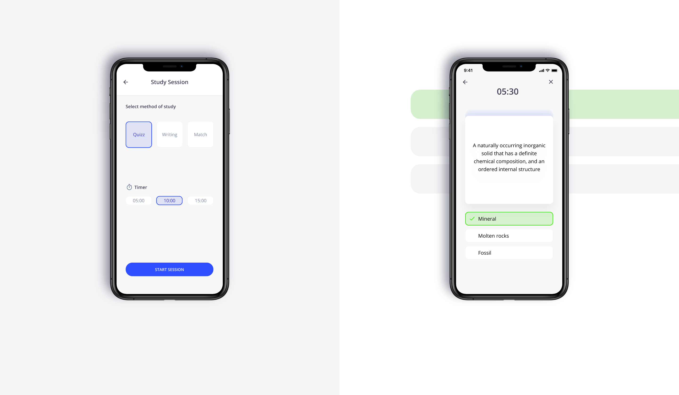
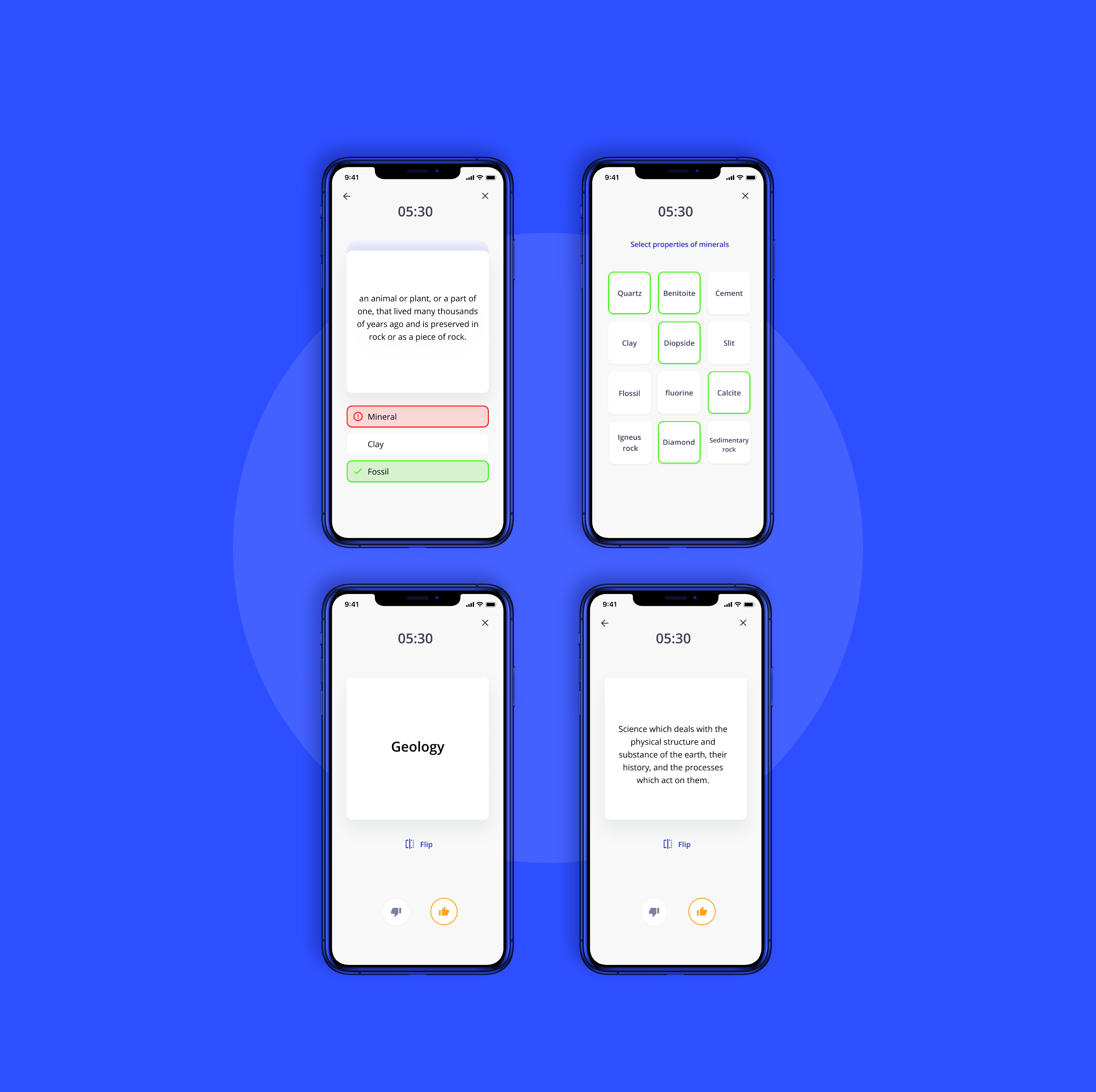
The application allows users to study their flashcards using different methods to learn and test knowledge: from quiz to match games. At the end of each study session, users can see at a glance their results.
Typography & Colours
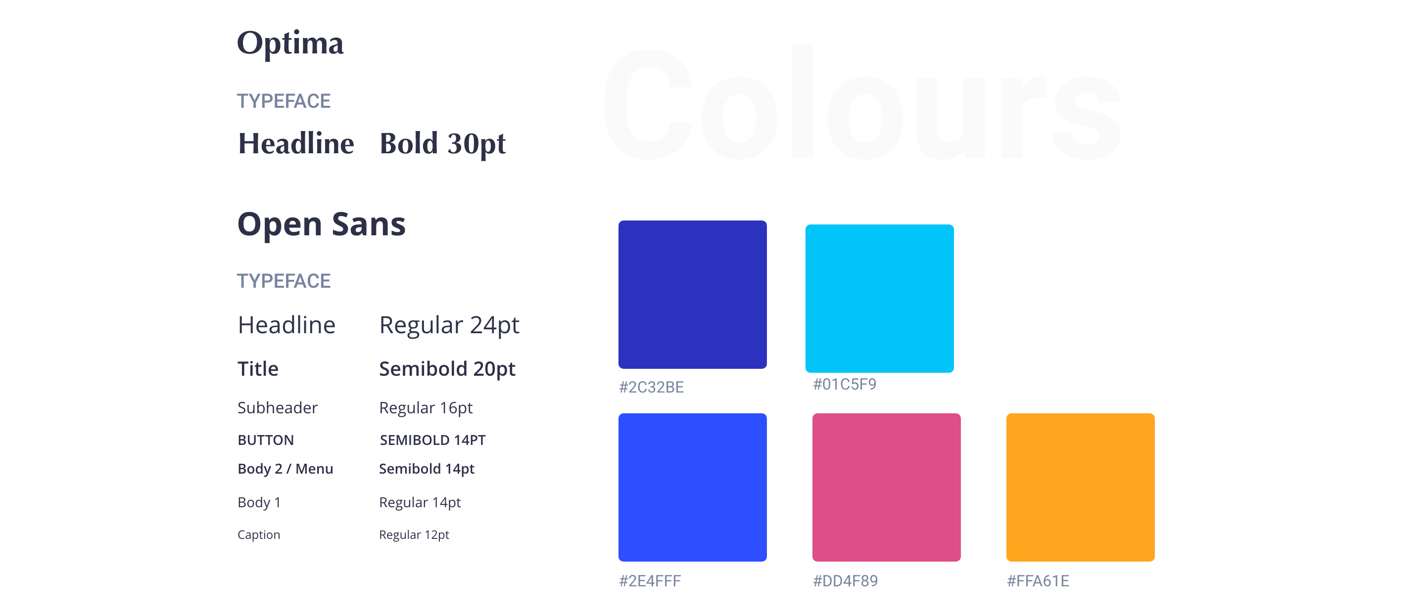
Open Sans is the cornerstone element of the product’s visual language. It has upright stress, open forms, and a neutral, yet friendly appearance and is optimised for legibility across print, web, and mobile interfaces.
Optima has been used for titles during the onboarding process. It makes the interface more distinctive and attractive, without losing legibility.
Strategically selecting the colours for our product will allow us to create the feeling of calm and security we hope to invoke. Also, it brings a unified and recognisable consistency to the product.
For illustrations and card, I chose some playful colours, as pink and yellow to make the experience enjoyable and remarkable.
Illustrations
Illustrations can communicate personality, delight users goals or make UI more informative. I adapted the illustrations from unDraw. The illustrations’ colours were adapted to the brand’s universe, using variations of blue, pink and yellow as main colours.

Conclusion
Lessons learned
The challenge of the project was to design a product that enables users to learn new vocabulary by offering an enjoyable learning experience.
Once complete that case of study I would point our two lessons learned.
Understanding users should be one of the first goals of my projects.
The information gathered from the user research is the key to designing a digital product that successfully meets their needs.
User Flows as a core method to design user interaction with our product. When creating my first wireframes I focused on designing the different screens, rather than the user flows through my product. Taking a step back and concentrating on user flows rather than individual pages will make my design more user-centric and, therefore, more successful from your user point of view.